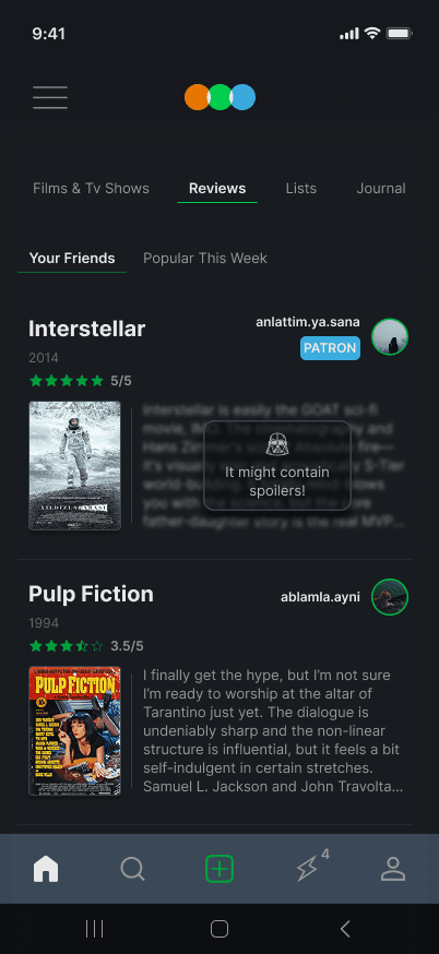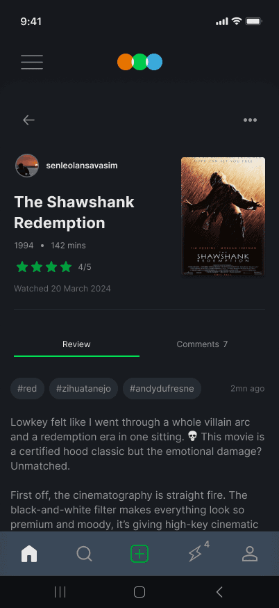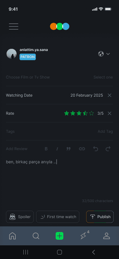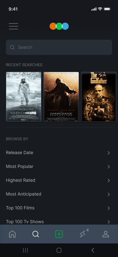
As someone who loves watching movies and enjoys rating them, I've been using Letterboxd's mobile app for a very long time.
However, as a user, there were aspects of the application that annoyed me.
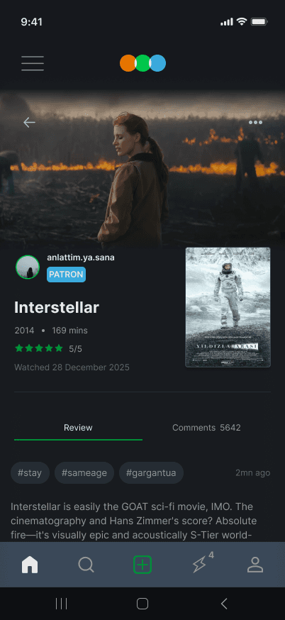
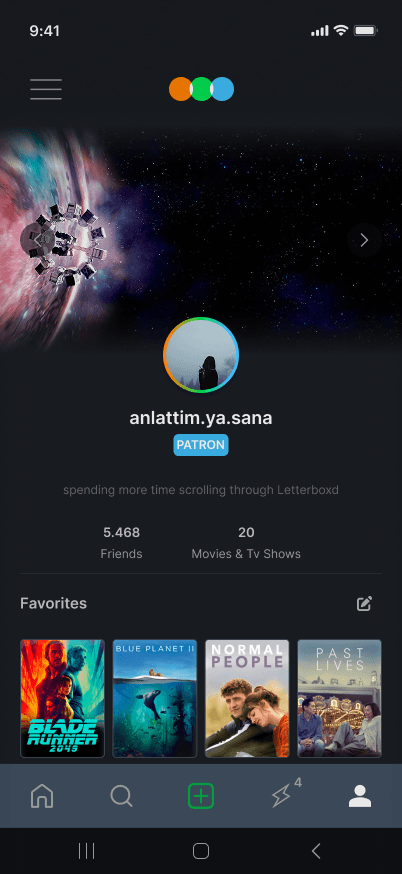
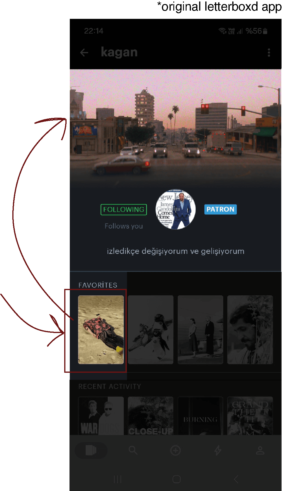
For example, as a benefit of PATRON membership, it allows you to put a cover photo on your profile. And even if you list 4 favorite movies on your profile, it only allows you to use a cover photo of the first one listed. This is quite annoying.
*original letterboxd app
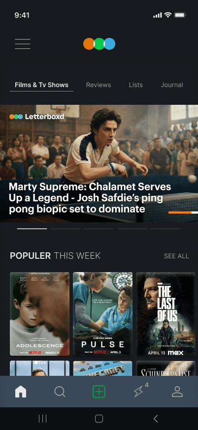
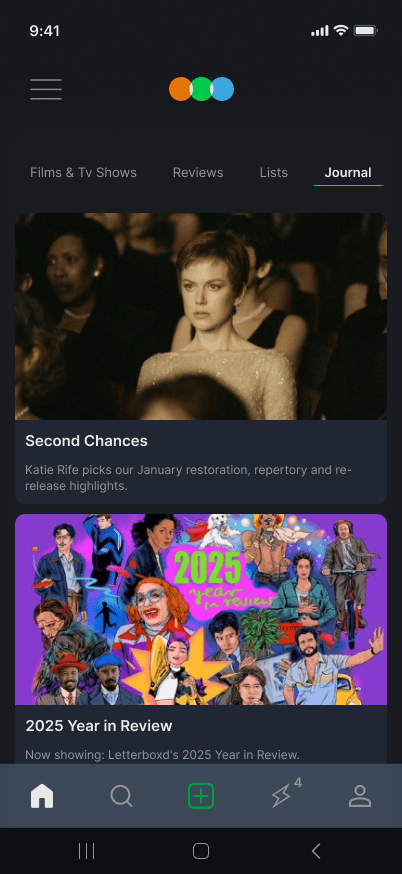
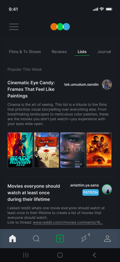
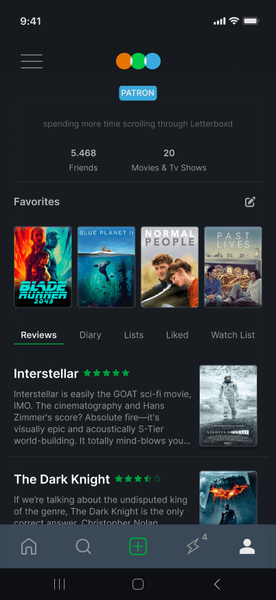
*MY REDESIGN
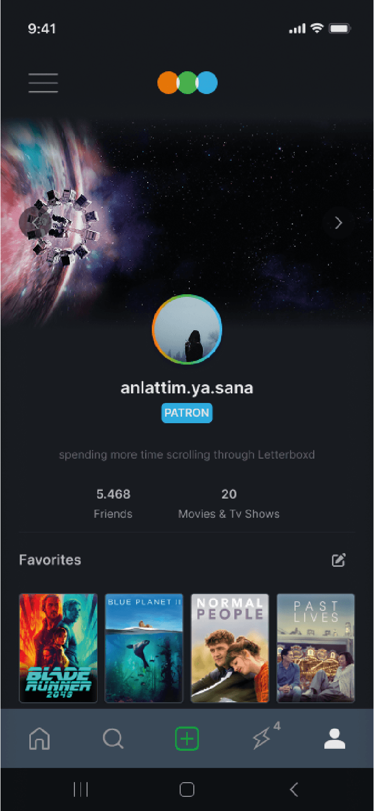
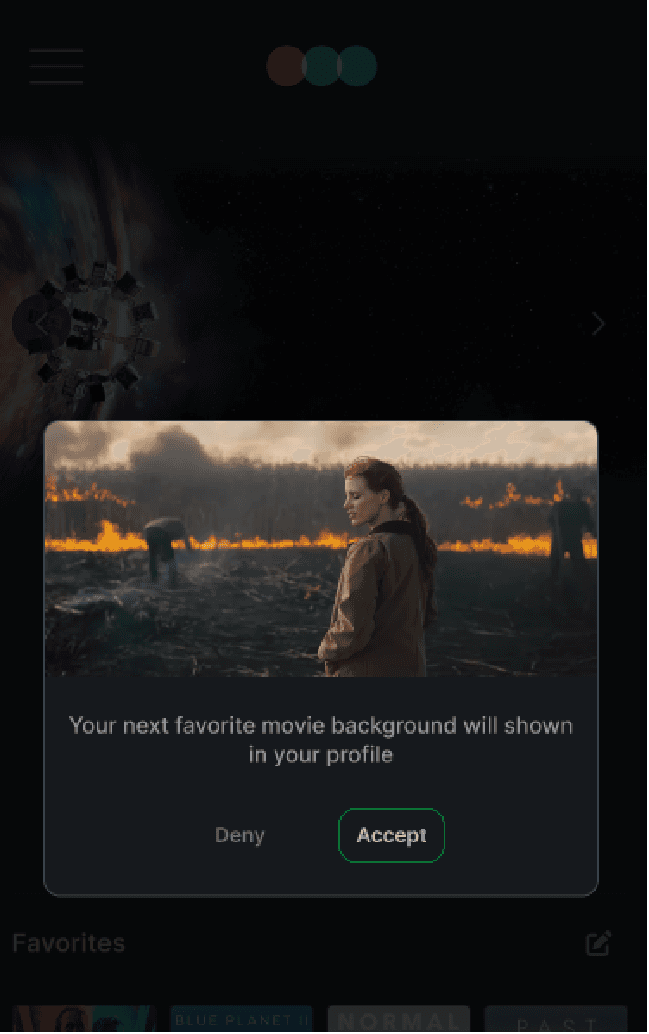
I, however, introduced the following feature to solve this problem. Now people can choose multiple cover photos from their favorite movies and display them sequentially on their profiles. I've added navigational buttons for this; when you click the buttons, a confirmation box appears asking, "Do you want to move on to the next cover photo?"
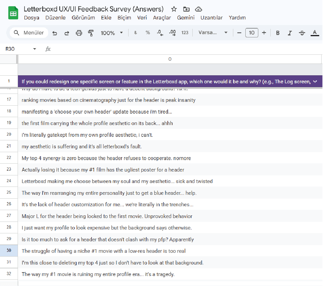
Based on data I gathered by asking Letterboxd users, I learned that dozens of people are also complaining about this situation.
*original letterboxd app
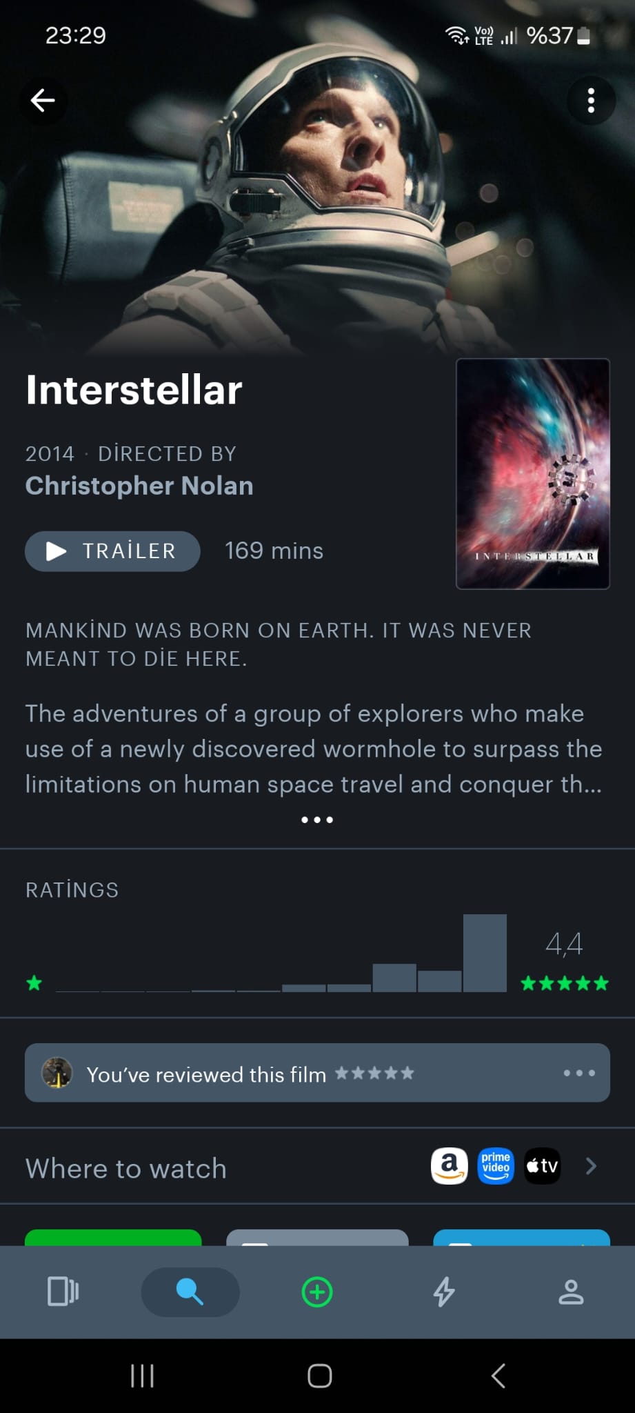
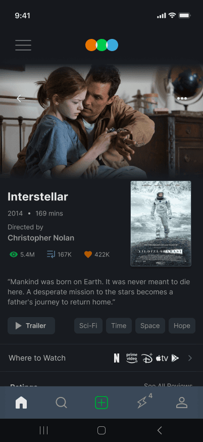
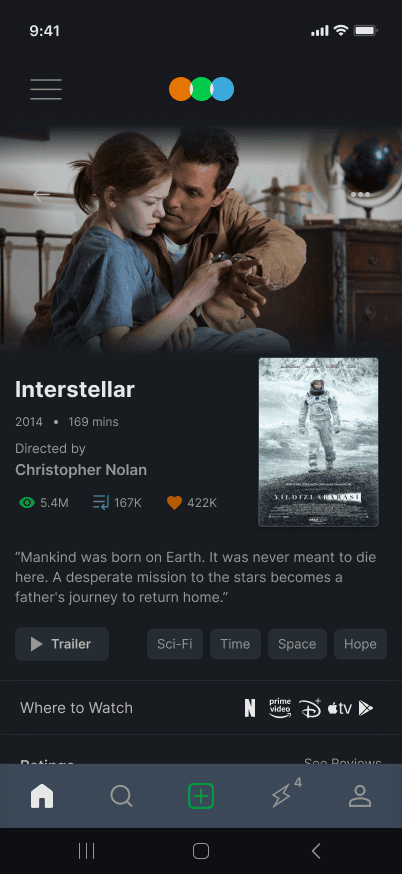
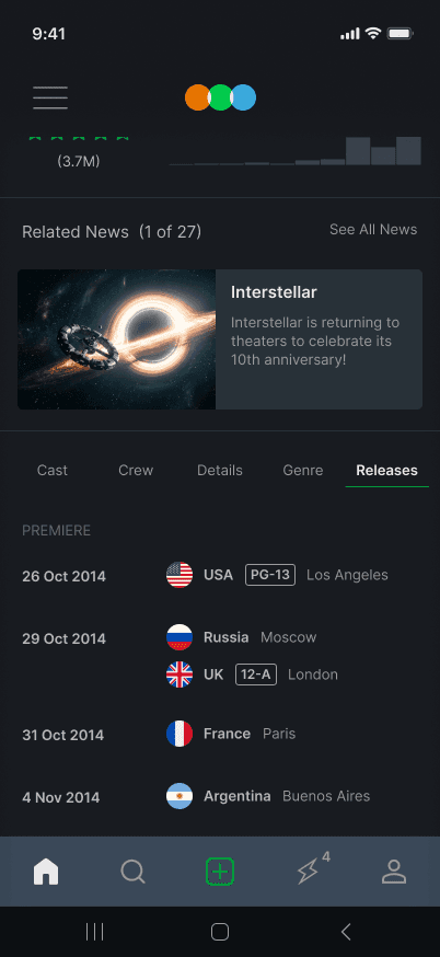
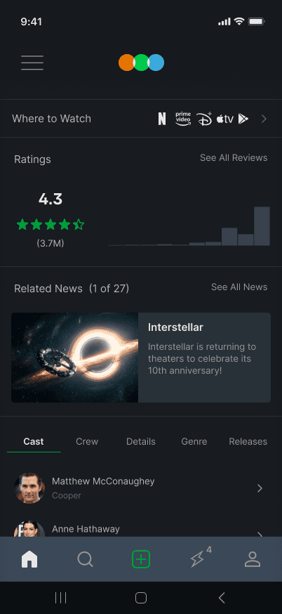
Also there were some misunderstood parts.. like duration of films is next to trailer button, people might think like "does trailer last 169 min?" so i changed that , and changed design as well.
*MY REDESIGN